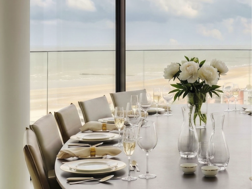
A house is not read in its volumes alone, but in the gestures it permits. Setting a table reveals what the architecture had already declared: a material, a light, an intention. From the lime plaster of a Ghent townhouse to the black casements framing a Brabant park, from the continuous Mortex of a Knokke apartment to the Burgundy stone of a Kempen villa, each property possesses its grammar. For each, we sought the tableware that extends it; not as decorative accessory, but as the final line of one script.
Architecture first
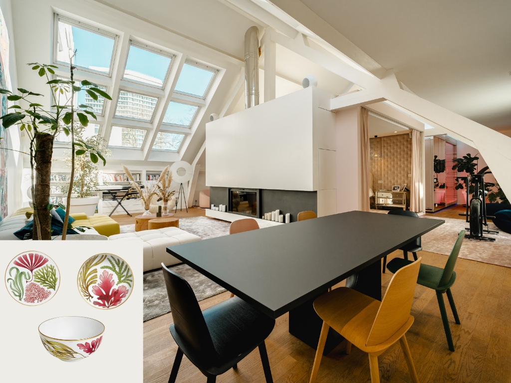
Beneath the whitewashed beams of this Ixelles top floor, the zenith light glides across the oak and settles its reflections on a dark table, almost mineral. The Chatelaine apartment cultivates that tension: pared-back structure, a botanical palette (ochre, deep green, coral) and greenery invited indoors. The Hermès Nature Marine service finds its setting here: its seaweed and corals drawn in gold extend the botanical gesture already present in the room and animate the graphite tabletop like a work placed upon its plinth. A table where the art of entertaining converses with architecture.
The garden as a living room
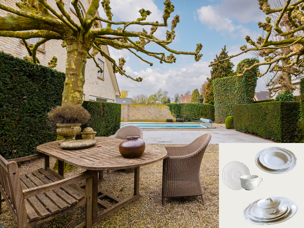
Here the landscaped garden composes an architecture in its own right: hedges clipped to the line, pollarded plane trees with sculptural silhouettes, natural stone terraces ans a heated pool as backdrop. A 580m² villa where the patina (pale brick, grey teak, antique stone basins) stands as the true luxury. The Gien Rocaille blanc faience answer it with quiet inevitability: pure white, relief borders inherited from the eighteenth century, an elegance that never seeks to be noticed. Laid beneath the branches, it turns the summer lunch into a ritual and the garden into a dinning room.
Geometry as a signature
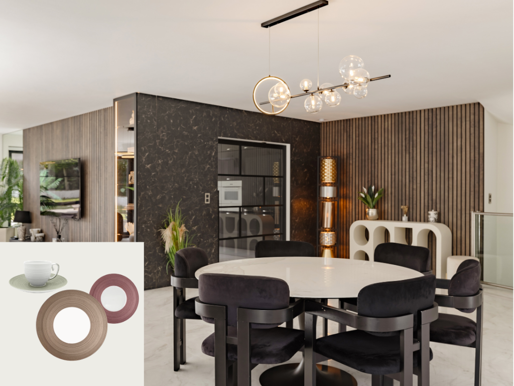
This contemporary villa of approximately 390m² plays on a controlled palette: vertical timber battens, a panel of dark veined marble, a round table in pale stone and the depth velvet seating. A 2019 architecture where each texture answers the next, beneath abundant natural light. The Coquet Hémisphère Couleurs porcelain extends precisely that vocabulary: Limoges white, a finely ribbed rim, flat planes of taupe, rosewood pink and eau de nil. Nothing ornamental, a play of material and proportion, set upon the stone that completes the composition without ever overloading it.
The wabi spirit
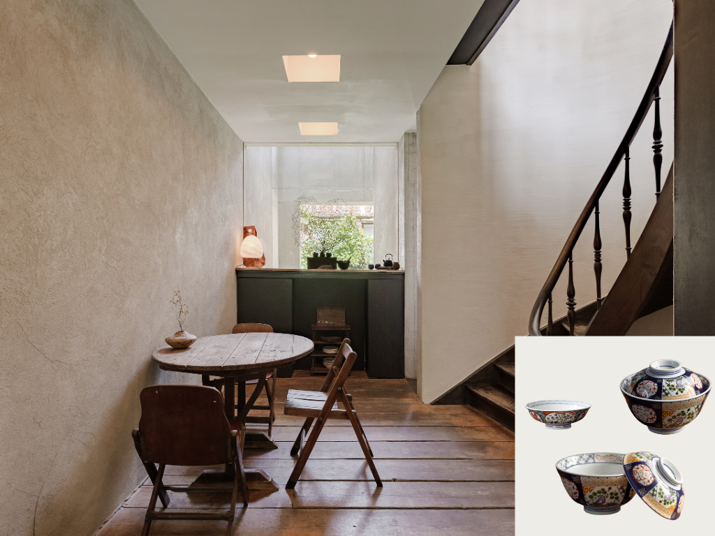
Concealed in a lane near the Veldstraat this townhouse of approximately 125m² bears the imprint of Axel Vervoordt and Tatsuro Miki: vibrant line plaster walls, old floorboards worn to a patine, generous chilling heights ans a restrained light. A constant dialogue between medieval Flanders and Japanese sensibility. The Japanese tableware from Minecraft finds its natural place here: Imari blows in deep blues and iron red, shaped in Mino for four centuries, where irregularity is what makes the beauty. Set upon the raw, they extend precisely what the house expresses: refinement within imperfection.
Restraint as luxury
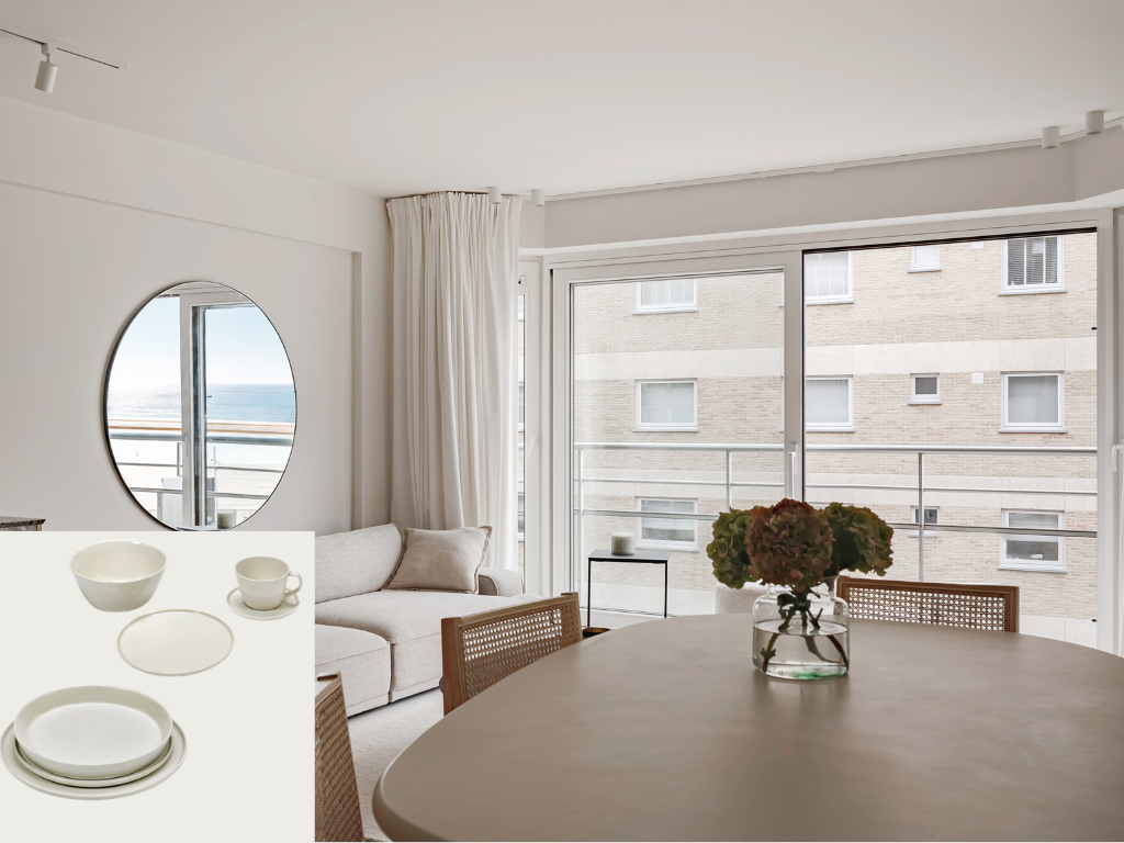
On the Rubensplein, this apartment of approximately 70m² makes restraint a method: a seamless Mortex floor, full-height glazing, a palette of sand and ecru, and the sea that slips as far as the mirror. South-west facing, light that lasts until sunset. The Cena collection designed by Vincent Van Duysen for Sera, answers it here with the same grammar: glazed stoneware in mineral tones, faintly irregular edges, essentiel forms conceived for the gestures of daily life. Two Belgian hands writing the same warm minimalism: architecture first, the table as its extension.
Heritage reinterpreted
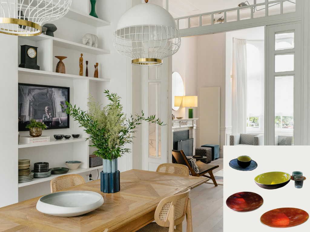
This 1898 mansion of approximately 409m², renovated in 2014, cultivates the art of dialogue: double doors, moulding and a marble fireplace stand alongside solid oak parquet and white niches where objects and ceramics are displayed. Over 4m of ceiling height, a clear light, a village spirit in the heart of Uccle. The Touron collection by Jars Céramistes finds its register here: stoneware thrown in the Drôme, deep glazes (olive green, storm blue, terre de eu) whose nuances come alive in the kiln. A craftsman’s material, never. Decorative, matched to a residence that owns its character.
Nature in the frame
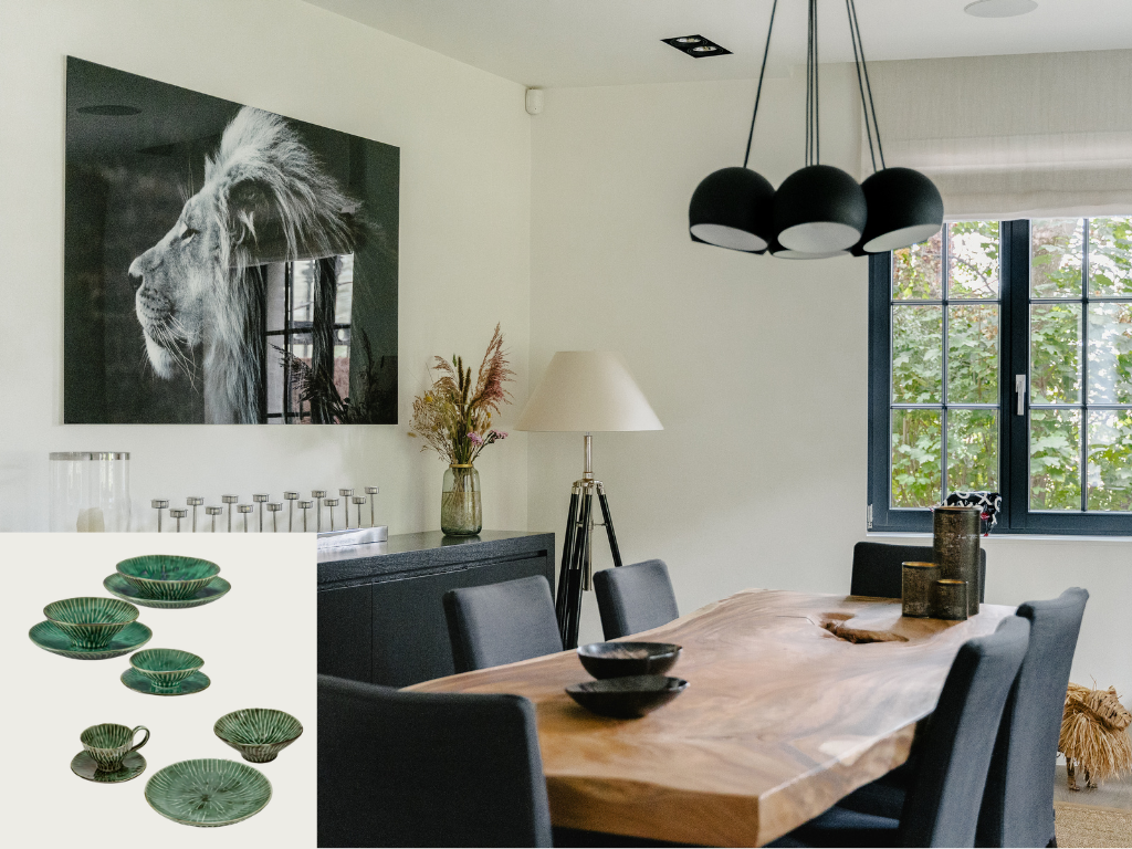
This nineteenth-century property, approximately 485m² renovated in 2016 within an 82-are wooded park, plays contrast with assurance: a solid wood tabletop with a live edge, black window frames that cut the greenery into a painting, dark spherical light fittings and a large black-and-white wildlife photographer. An interior that lets nature in by framing it. The Sera Verde Lanza faience finds its exact echo here: deep green, ribbed relief, a glossy glaze that catches the light of the park. The color of the foliage carried to the table, the house continued all the way into the plate.
What links these seven residences is neither a style nor a period, but a conviction: refinement is born of coherence. A ribbed deep-green faience calls for a park; a stoneware that owns its regularities answers a patinated floor; a Limoges porcelain in mineral tones completes a contemporary composition. The table becomes the place where the house speaks of itself in a low voice, int the choice of a glaze, the curve of a rim, the depth of a blue. That, no doubt, is where exceptional real estate distinguishes itself: it is not possessed, it is lived.
Our regional specialists welcome you for a private viewing.
