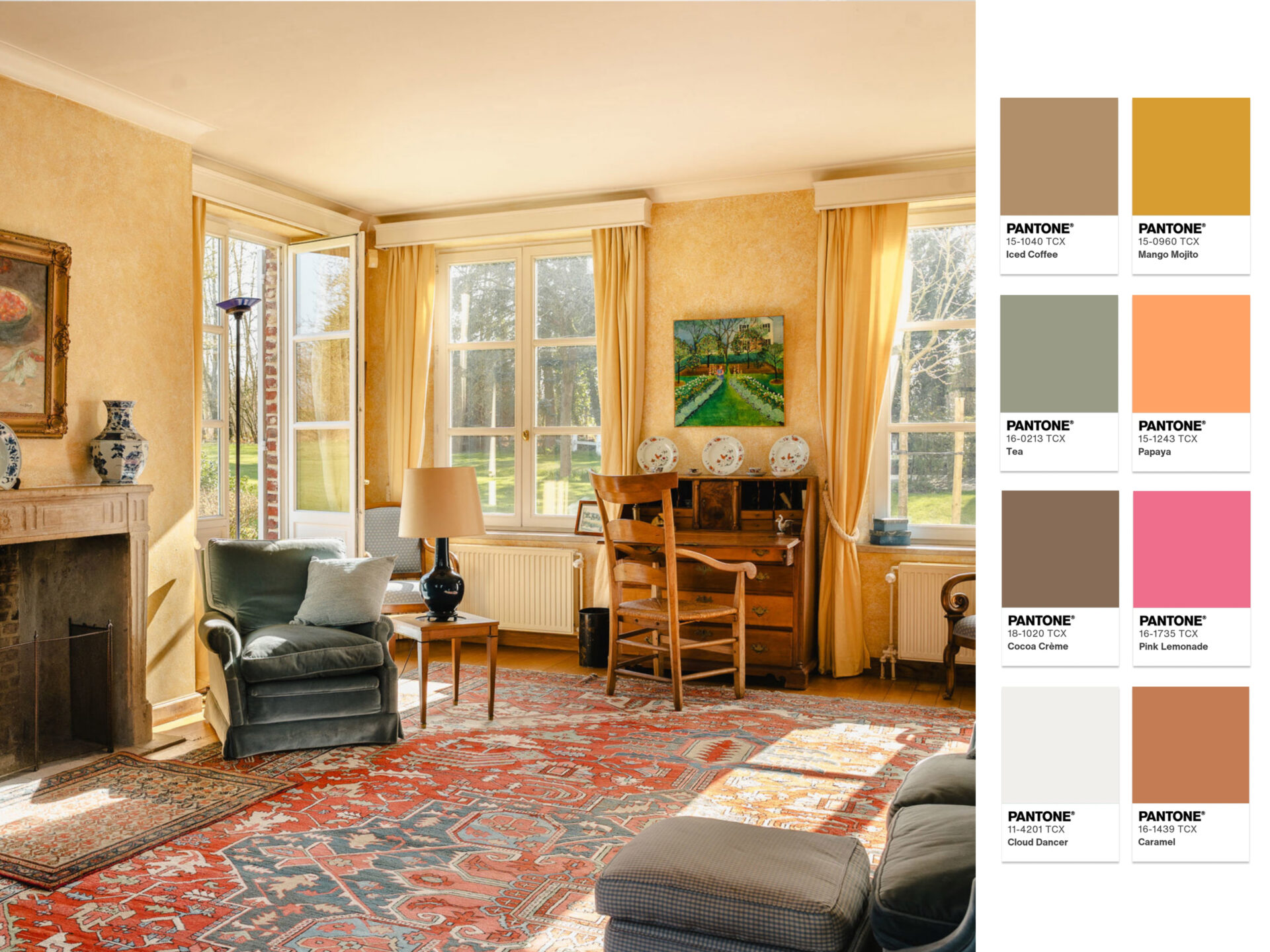
Pantone’s 2026 colour palettes introduce a refined shift toward warmth, balance, and understated sophistication in contemporary design. Discover how these palettes are reflected in our properties, where colour and architecture come together in perfect harmony.
Powdered Pastels
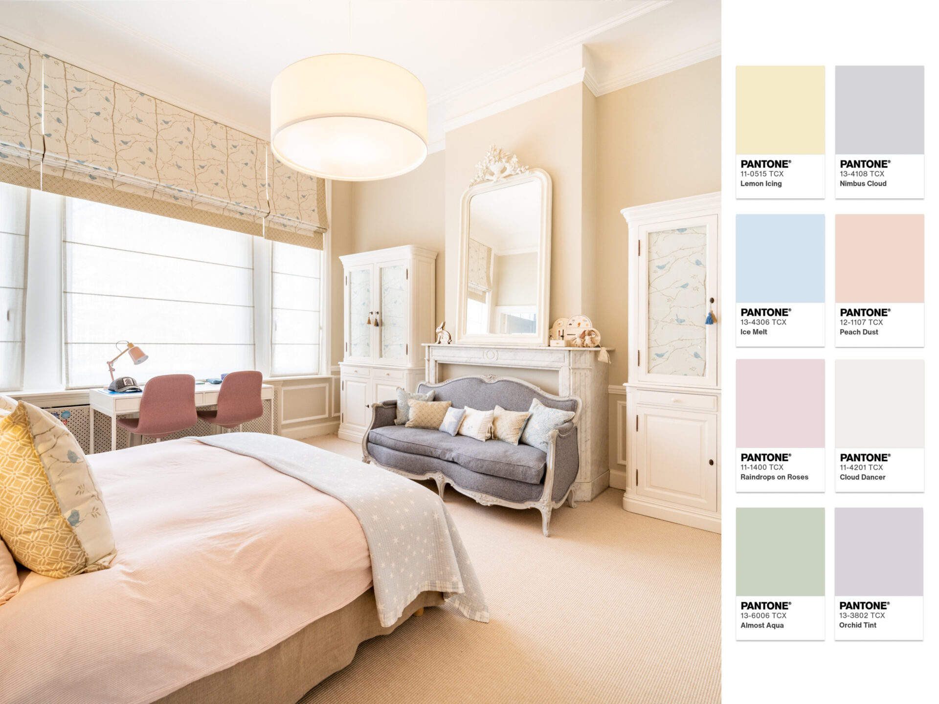
The Powdered Pastels palette is defined by soft, airy tones that evoke lightness and calm sophistication. Blush pinks, muted lavenders, gentle peach hues and washed-out blues create interiors that feel luminous without being overpowering. This palette thrives on subtle layering, where colour becomes almost atmospheric, shaping spaces through softness rather than contrast.
In this residence on Avenue Molière in Ixelles, these principles come to life in a refined interior where pastel shades enhance the architectural elegance of the home. The room featured in this property is bathed in natural light, allowing its delicate tones to gently shift throughout the day, reinforcing a serene and balanced atmosphere.
Atmospheric
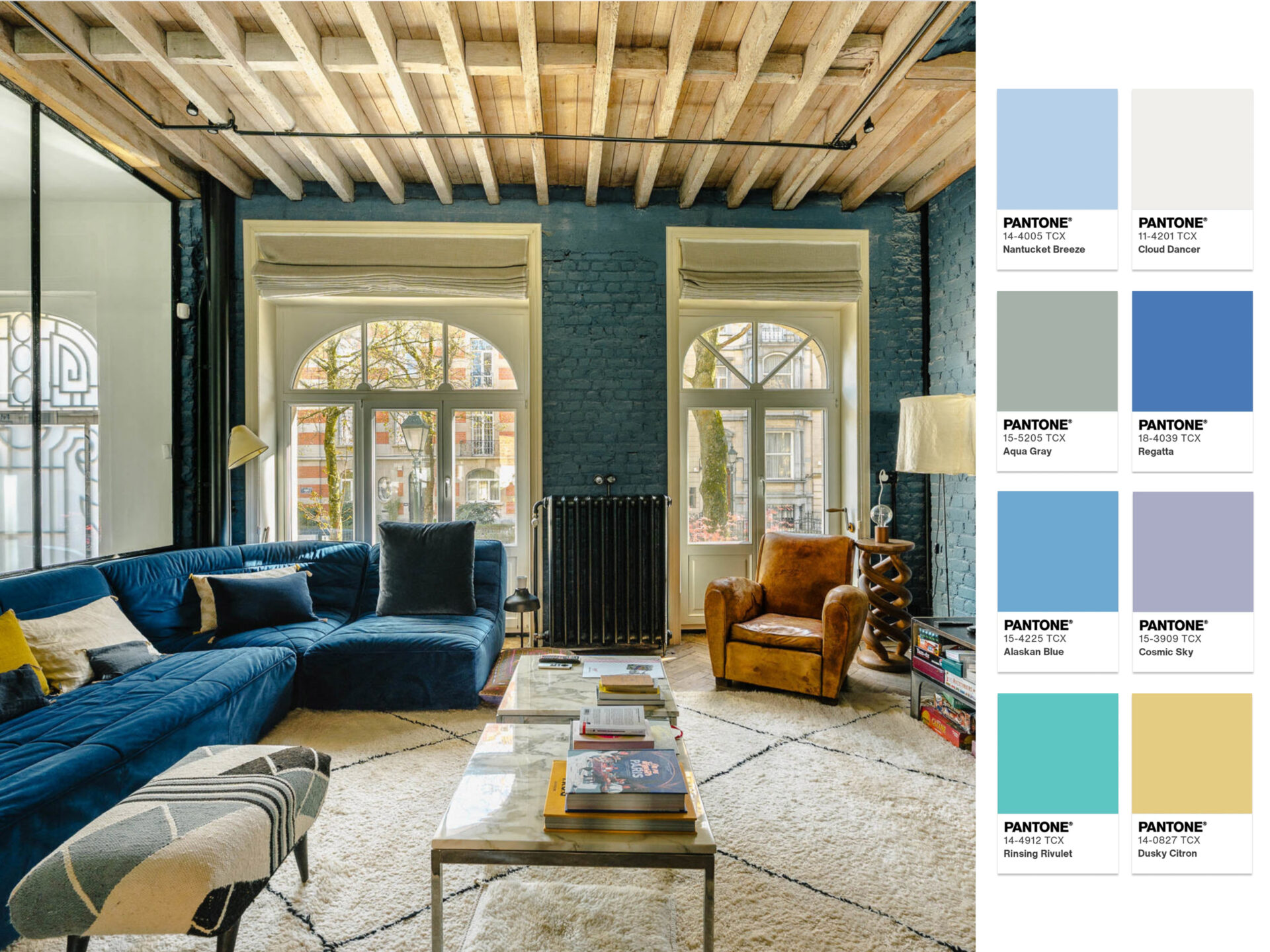
The Atmospheric palette draws inspiration from open skies, coastal horizons, and the subtle interplay between light and water. Soft blues, misty greys, aquatic greens, and delicate lavender undertones create a sense of serenity and openness, while deeper shades add structure and depth. The result is a palette that feels both calming and sophisticated, bringing a quiet elegance to contemporary interiors.
This atmosphere is beautifully echoed in the living spaces of this exceptional property on Avenue Molière in Uccle. The room’s refined blue accents, generous volumes, and abundant natural light evoke the same airy quality found in the palette. Much like Pantone’s Atmospheric selection, the interior creates a seamless dialogue between softness, light, and timeless sophistication.
Glamour & Reflection
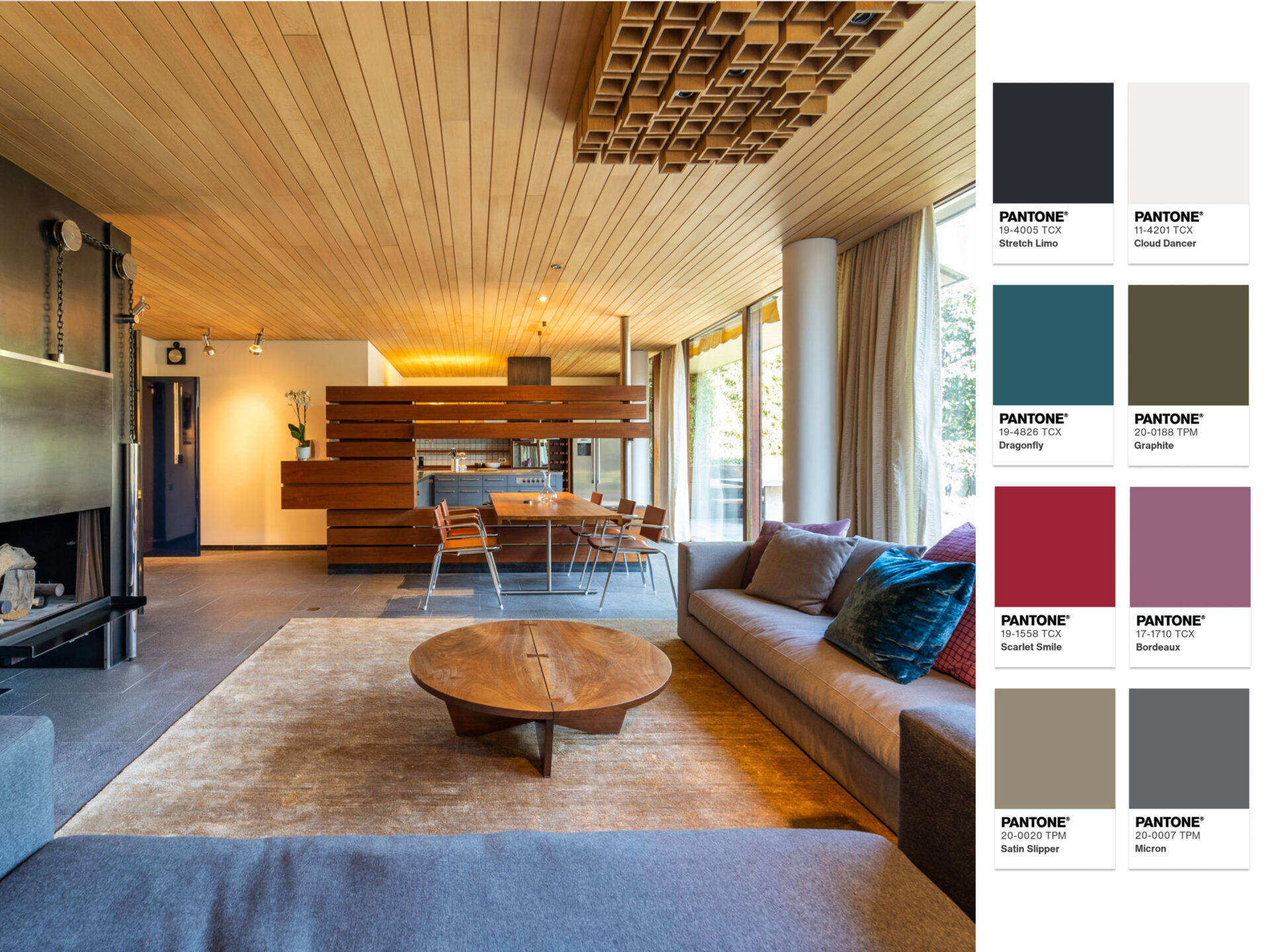
The Glamour and Reflection palette is defined by soft luminous neutrals, smoky greys, and deep mirrored tones that shift subtly with the light. It balances warmth and restraint, where champagne-like beiges, silvery undertones, and muted dark accents create an atmosphere that feels both polished and introspective. The overall effect is one of quiet luxury, where surfaces seem to capture and reflect the surrounding light rather than simply contain it.
In this residence located by the Ixelles Ponds, this palette is reflected in the home’s sense of sophistication and calm. The darker wood elements, the black fireplace, and the deep grey sofa embody the richer, shadowed side of the scheme, anchoring the space with elegance and visual weight. These deeper tones are softened by the surrounding light and reflections from the water outside, which lift the composition and makes it feel lighter.
Take a break
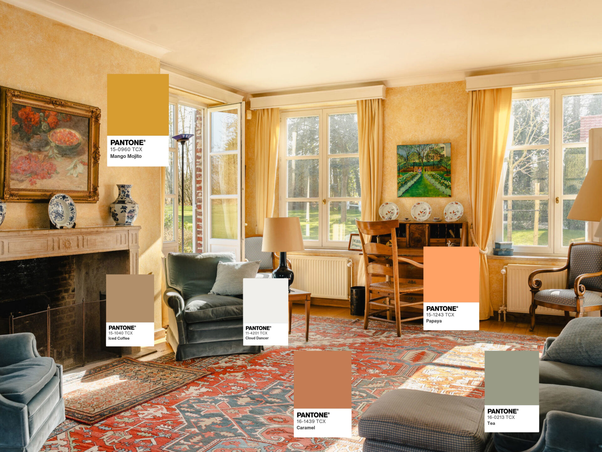
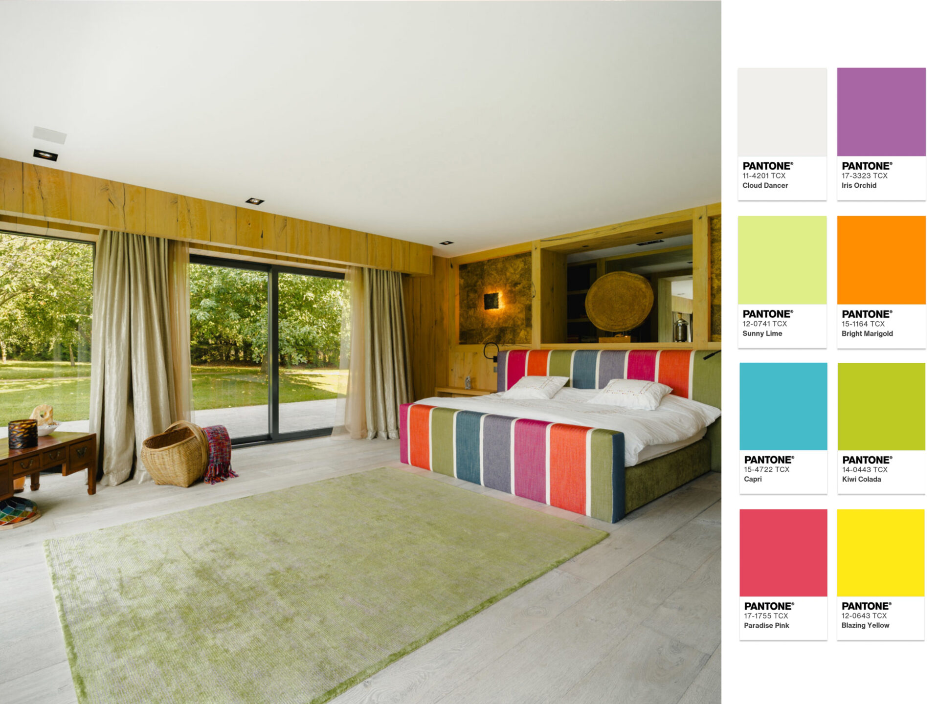
The Take a Break palette is built around soft, restorative tones that evoke calm and ease. Warm sandy neutrals, muted blush beiges, and gentle earthy browns create a cocooning base, while subtle hints of olive and desaturated green introduce an organic freshness. The result is a balanced, soothing composition that feels grounded, welcoming, and effortlessly elegant.
In the Lasne property, and particularly in this living space, the palette comes to life through its tactile contrasts and natural light. The warm wooden elements and earthy brown furnishings echo the deeper tones of the scheme, while the soft neutral fabrics and walls reflect its sandy, restful base. Framed by generous openings to the garden, the room feels gently suspended between indoors and outdoors.